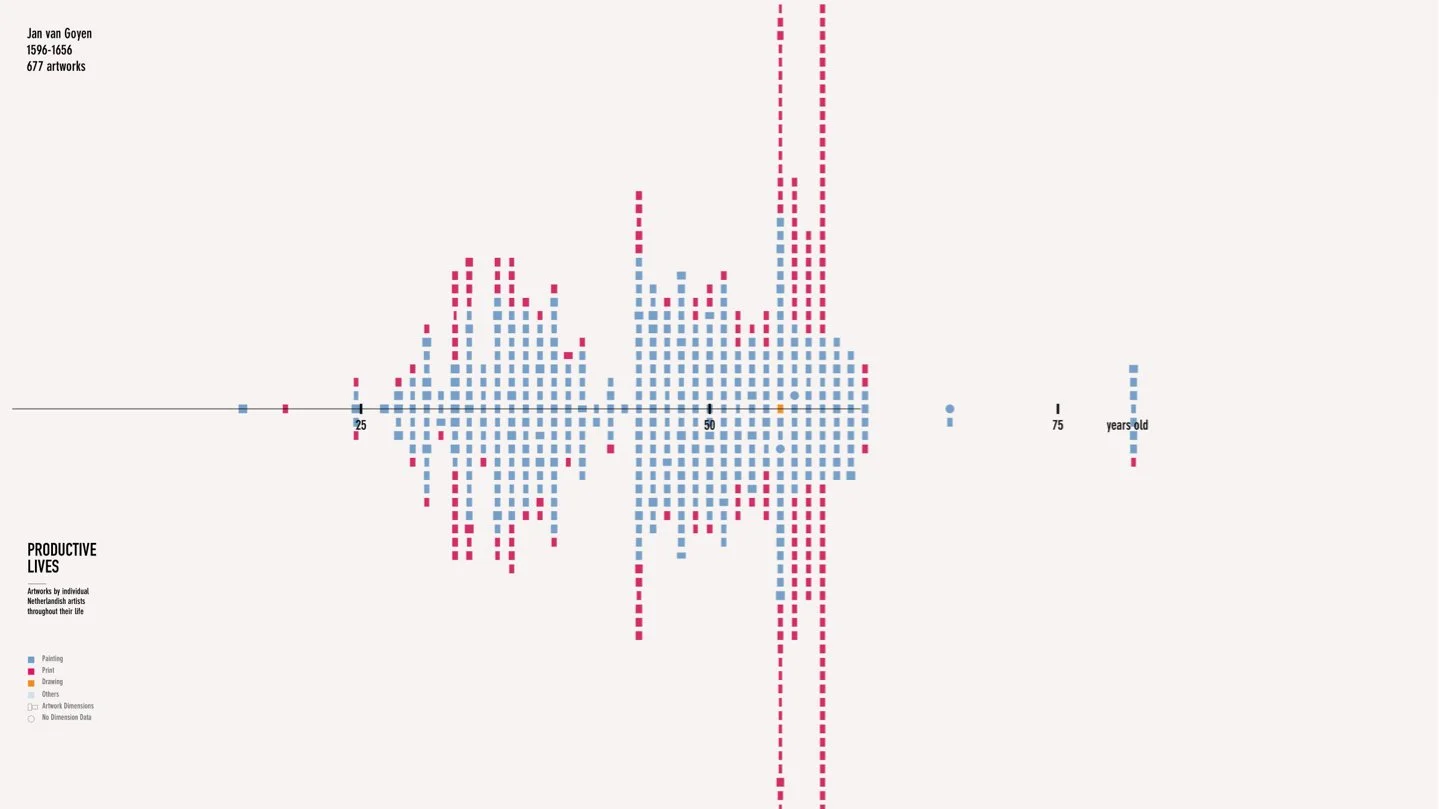
Visualizing Dutch Art Market
From Historical Insights to Data Visualizations in the Boston Museum of Fine Arts' Netherlandish Galleries
Overview
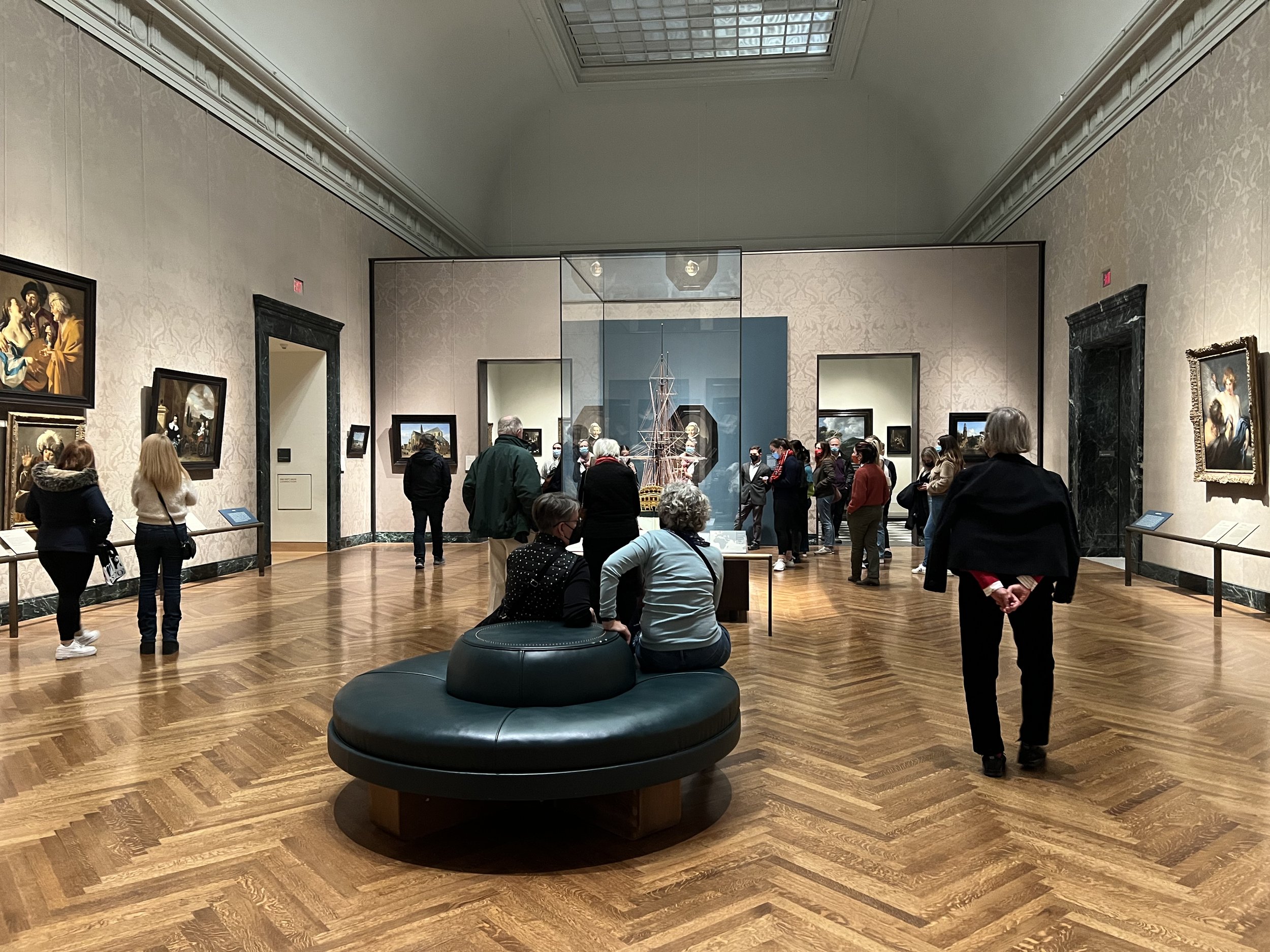
On November 20, 2021, the Boston Museum of Fine Arts (MFA) launched its Center for Netherlandish Art galleries. Collaborating with our Northeastern University team, we developed two data visualizations to enrich the visitor experience. I worked end-to-end on this project under the mentorship of two professors. I worked end-to-end on this project under the mentorship of two professors, taking charge of various stages including ideation, data manipulation, prototyping, design, and code execution.


Initial project brief
The MFA's curatorial team engaged with us to bolster the narrative of exhibitions in the newly inaugurated gallery through information design. Our initial dialogues with the MFA team uncovered their aim to introduce a novel economic narrative to the collection. They elucidated,
"Historically, art was predominantly commissioned, but in the 17th-century Netherlands, the creation of art transformed into a commercial endeavor. This period marked the genesis of the modern art market as we know it. Additionally, the competitive market fostered a plethora of artistic strategies.”
Accordingly, we articulated our initial design aim as:
How can we visualize data to represent the prosperity of Dutch art in the 17th century from the perspective of the market and artists?
Early research and ideation
Guided by our initial design objective, we kicked off the design process with a brainstorming session, inviting participation from the MFA team. I employed affinity diagrams to categorize and identify potential design themes. We extracted essential variables from our top concepts and progressed to the database research phase. We opted to utilize datasets provided by the Netherlands Institute for Art History (RKD), after evaluating various public databases. The RKD datasets encompass information on over 370,000 artists and more than 250,000 artworks, ranging from the 15th century to contemporary times. We selected this database for its extensive, comprehensive, and current data relevant to our focus area.


Refined design objectives
How can we visualize data to represent the prosperity of Dutch art in the 17th century from the perspective of the market and artists?
Density
Illustrate the flourishing 17th-century Dutch art market by depicting the increase in artwork production.
Variety
Construct a visual representation of each artist's career life, highlighting the diversity by enabling comparisons of these profiles among various artists.
Final design
Two visualizations were developed and integrated into the exhibition, drawing on the RKD database and constructed using JavaScript. Together, they offer perspectives on the development of the Dutch art market during the 17th century and the diverse competitive strategies employed by individual artists.
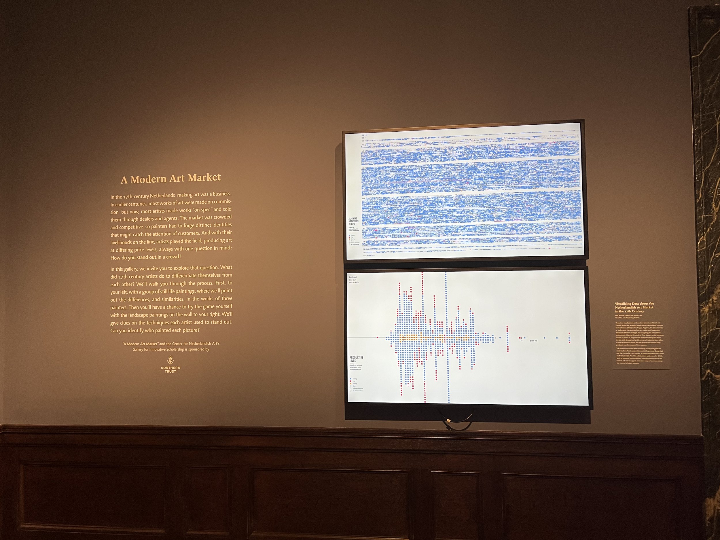
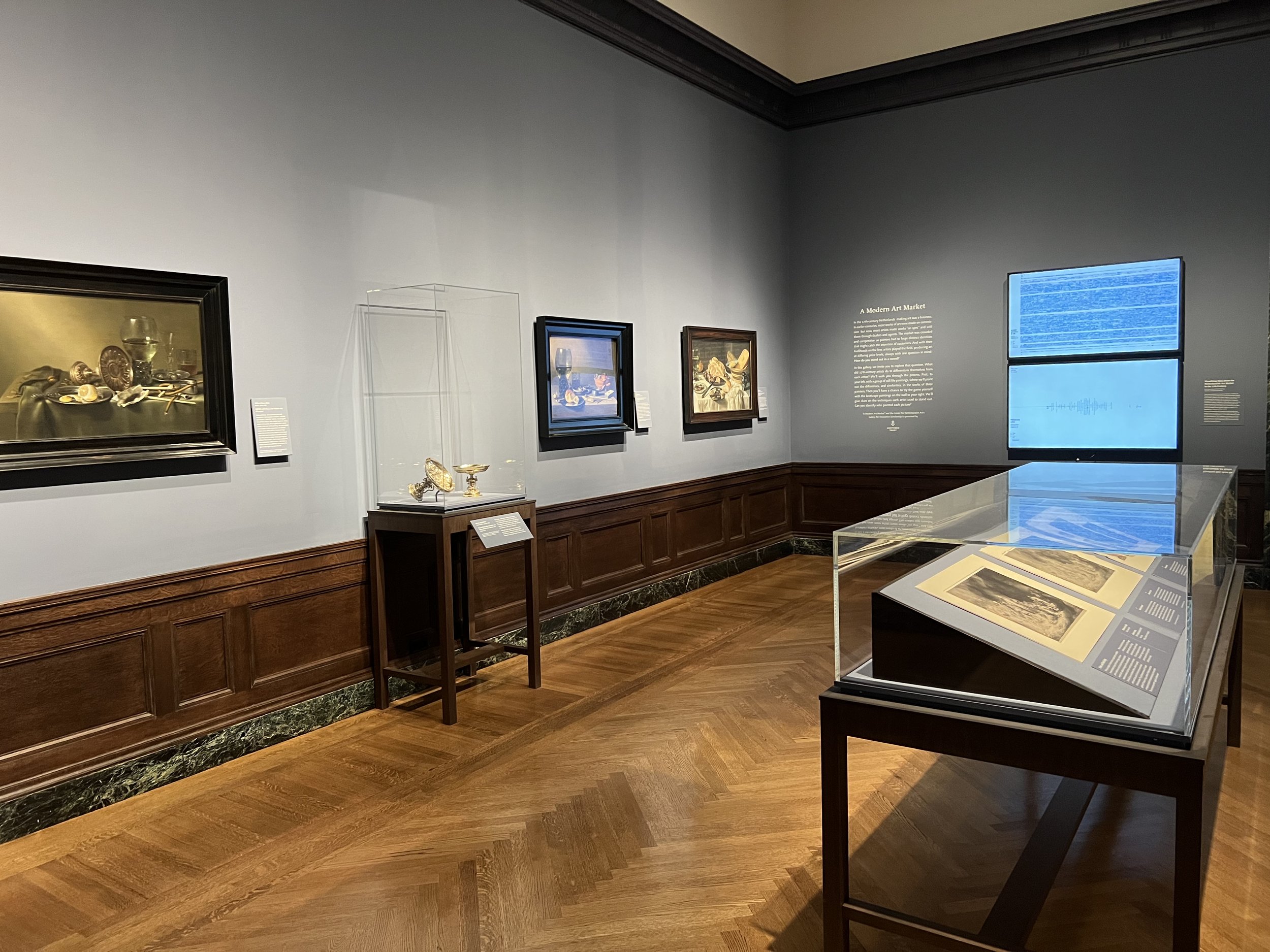
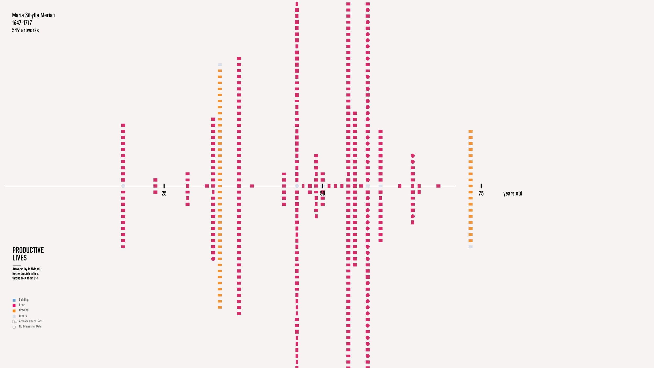
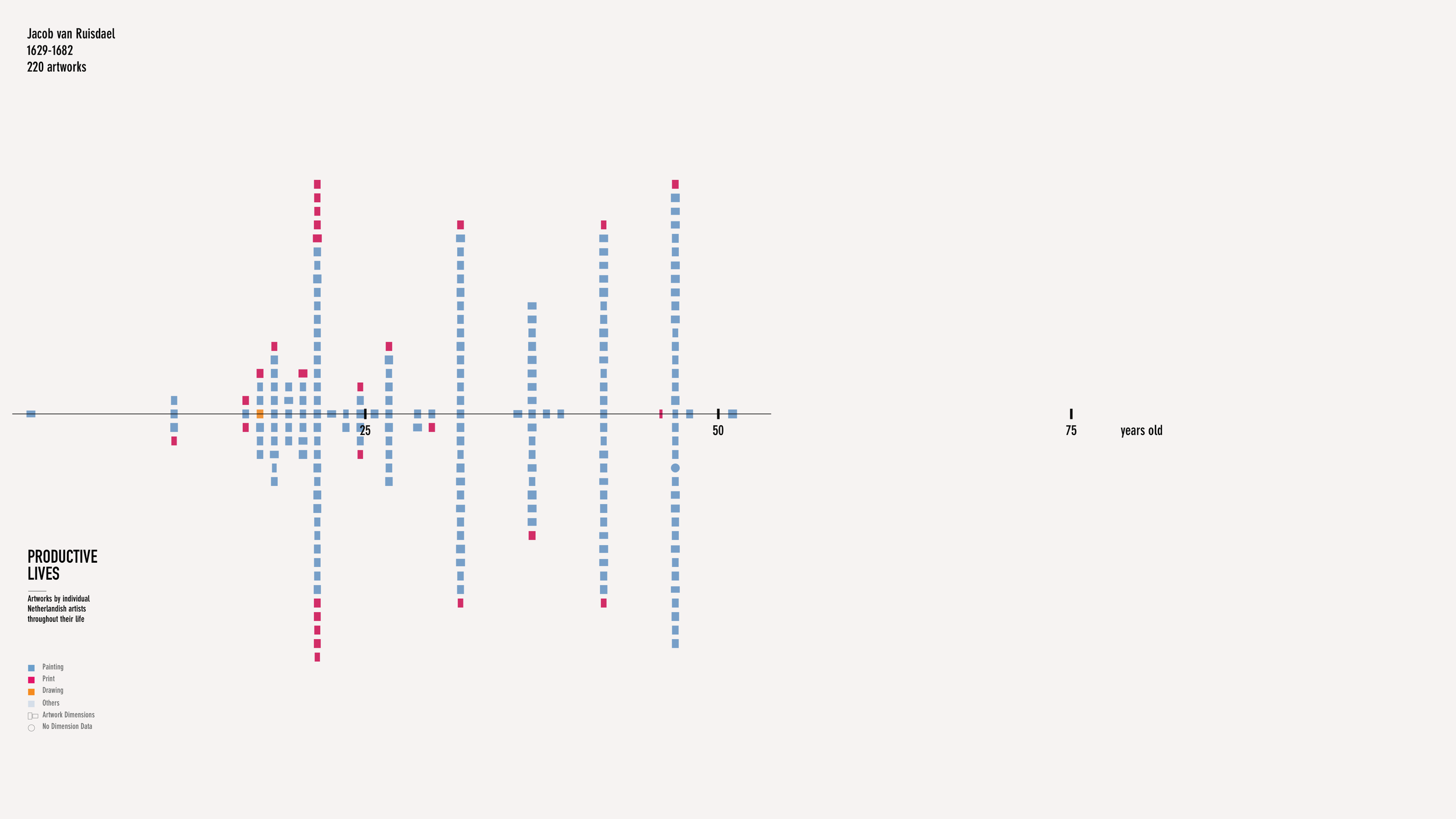
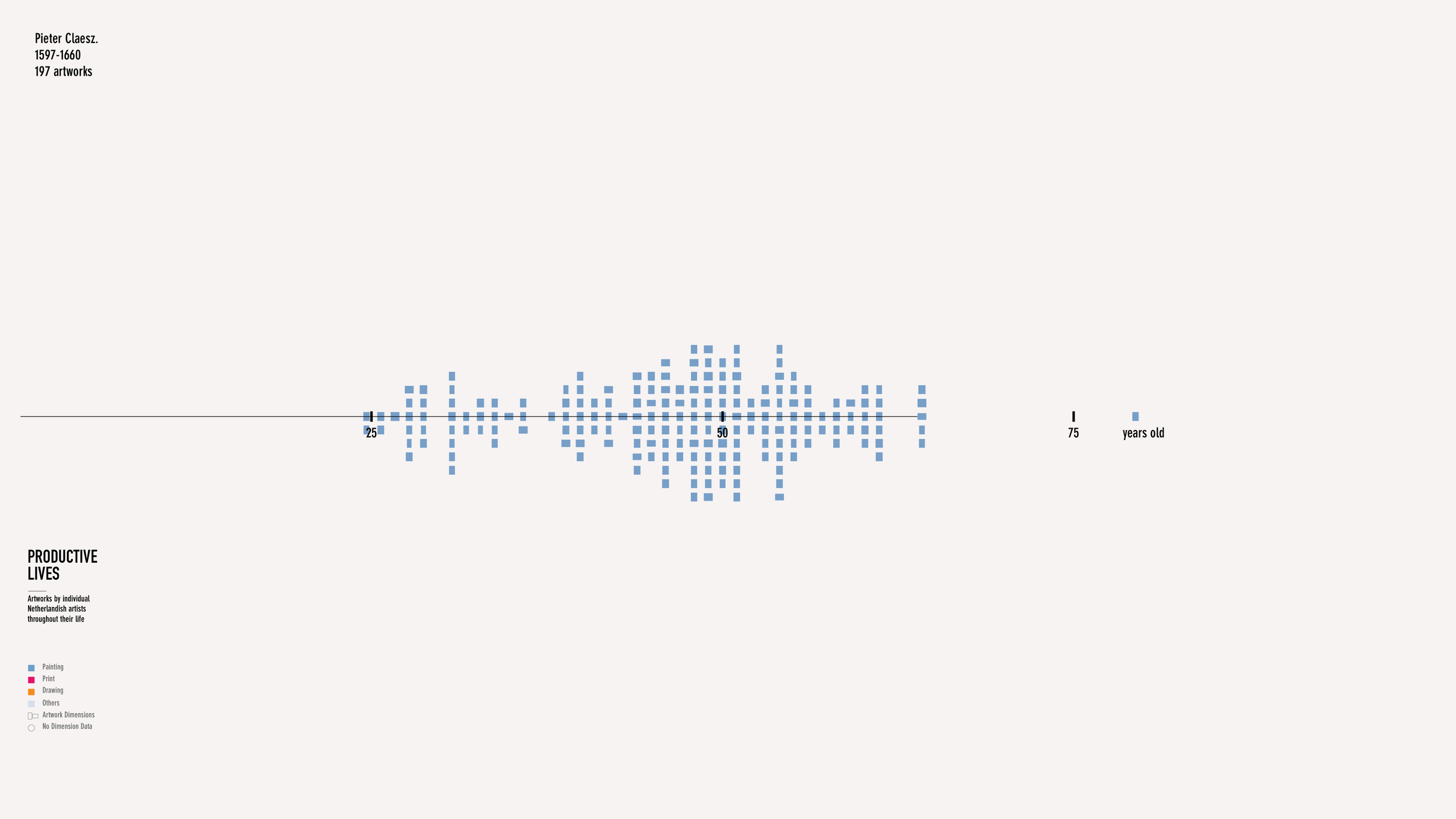
The fundamental element in both visualizations is the mosaic, symbolizing individual artworks. Color coding differentiates artwork types, and the aspect ratio reflects actual canvas dimensions when known. This consistency aids in maintaining a cohesive visual language across both displays.


Visualization 1
Aligning Artworks in Time
This visualization showcases the immense artwork production volume in the Dutch Republic from the 16th to the 18th century. It employs a mosaic pattern where each tile represents an artwork, with the total volume segmented into 25-year periods. The periods with higher artistic production are visually more prominent, clearly indicating the production peak in the 17th century to viewers.
An animation simulates the flow of time and the accumulation of art, with each mosaic emerging sequentially, symbolizing the burgeoning art scene through time. Initial enlargement of each mosaic as it appears creates a dynamic beam effect.
Visualization 2
Productive Lives
Productive Lives presents the career spans of individual artists and their corresponding artwork outputs. Artworks are stacked vertically for each year of an artist's life. The visualization animates like a flipbook, swiftly cycling through artists and decelerating for those of particular note. This animation highlights the variance in productivity among artists and allows for in-depth exploration when paused.





Challenges along the way
The design process involves multiple rounds of sketching, data analysis, prototyping, and development. Along this journey, two particular challenges merited additional focus.




How can we make sense of dynamic datasets?
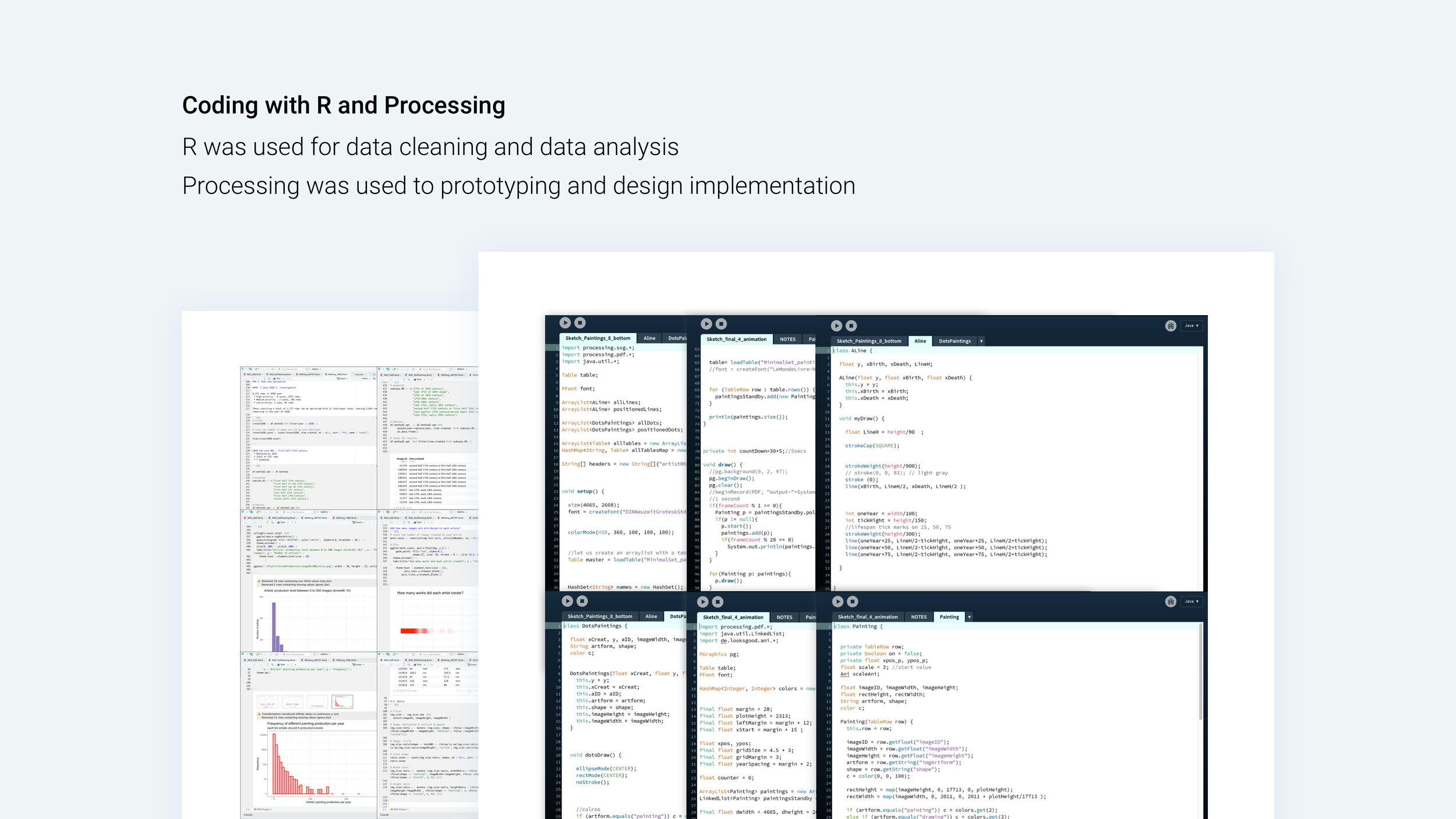
After extensive discussions with the RKD and MFA teams, we recognized the complexity and variability of historical data, presenting a significant challenge in data processing. I led this phase, using R for multiple data cleaning and analysis iterations to inform crucial design choices.
For example, the RKD datasets feature an 'Attribution' variable group, identifying potential creators of each artwork. However, it's common for artworks to have multiple attributed creators. Is this normal? In-depth analysis revealed that the attribution variable consists of a description and a name. I then talked with the MFA team and found that only half of these descriptions are reliable. For instance, an artwork "after Rembrandt" means it was created posthumously in his style, thus representing an unreliable attribution that should be excluded. With these insights, I streamlined the attribution data according to description validity, enhancing the dataset's accuracy and utility.

How can we accurately represent information despite the data's low resolution?
In the dataset, many artworks have imprecisely recorded creation dates, often as a range of years or a vague description such as “mid-17th century”. When visualized on a linear timeline with uniform spacing between years, this results in a significant clustering of artworks around the mid-century, a misleading artifact of the data's low resolution.
To circumvent such misrepresentation, focusing on broader trends rather than a detailed chronological scale is more effective. I addressed this issue by employing an adaptive timeline, which adjusts its span according to the number of artworks produced in each 25 years, thereby reducing clustering and providing a clearer representation of the data.


How do we highlight individual artists while representing the entire art market?
In our early sketches, we aimed to create a single visual representation that reflects both individual artists and the entire art market. To achieve this, we first needed to create a visual profile for each artist. Then, by stacking all the artists' profiles together, we would form a timeline to represent the entire art market.
However, as we developed low-fidelity prototypes using real datasets, we quickly realized we were dealing with a massive amount of data entries. At the scale suitable for the entire art market, individual artists would become too small to discern clearly. Seeking a single scale suitable for both the art market and individual artists might not be the correct approach. Therefore, we decided to create two separate visualizations: one focusing on the density of the art market and the other on the diversity of individual artists' competitive strategies.
Takeaway
Move quickly between drawing board and spreadsheet
Design prototypes direct the data cleaning process, while enhanced understanding of the data leads to improved design solutions. Working with actual datasets necessitates a dynamic and responsive feedback loop between the two stages of design.
Keep digging and seek expert input
When handling data in unfamiliar domains, it's crucial to explore the underlying knowledge and seek expertise to gain deeper insights.

